

June – Spring 2023
Cool Stuff, Volume 01.
Hello? Yeah, hey what’s up? What? It’s spring, yeah we know–– no, totally. We were like this 🤏 close to fist fighting hi–––RIGHT, like hurry up. Exactlyyyy, exactly… That’s what we said. Anyway, yeah we’ll talk to you later. We have a newsletter to write. Yup, that one. The one where we brag about stuff we’ve been working on recently. Okay, bye. Love you. ☎️
Sorry about that. We are very popular. Anyway, we just wanted to check in with you all mid-spring. While no groundhogs have had to catch these hands yet, we have been using them to click clack away on our computers and iPads making cool stuff. Please enjoy this fun little update on what we’ve been up to these last few months.
Openings


The Benjamin
Our recently finished project with The Benjamin in Ridgefield is now open! Please stop by and let them know their menu looks amazingly designed. And so do their coasters. As well as their gift cards. And their business cards… and their sign… sensing a theme here 🤔.
Benjamin Franklin was one of the influential diplomats that aided in the transport of old-world recipes from France to America. After researching his history, our team was inspired by the mystery of his pseudonym Silence Dogood. We developed a brand narrative that these transported, old-world recipes are being showcased with a modern, American twist at The Benjamin and The Red Door (their event space), making the everyday guest feel as though they are uncovering an exclusive invitation to a Secret Society Dinner Party.
The brand’s iconic key mark (drawn from the windows of the door of The Red Door) and keyhole speak to this sense of mystery while working in tandem to highlight one another, drawing attention to both the restaurant and the event space. Imagery of victorian dinner parties and elegant balls coupled with modern design sensibilities sets the perfect stage for this modern American, French-inspired restaurant and bar. Elevated with a touch of mystery, the brand invites guests to “uncover the world” of The Benjamin and The Red Door, keeping them coming back for more.


RAW*
We're always excited to brag about cool clients like Gina (who was recently mentioned in Forbes btw) and her concepts. Especially RAW*, which is now open in downtown Hartford.
RAW* “defaces” the traditional, stuffy oyster experience by reimagining raw bars into something more daring. By juxtaposing the beauty of oysters and the alternative nature of underground night clubs, RAW* is equal parts fancy and edgy, making it the next place to be for seafood.
The brand icon, the asterisk, is generally used on restaurant menus to denote the Consuming Raw Food warning. An asterisk is a beautiful shape but when interjected into a word it makes that word look censored, suggestive, and a little inappropriate. The asterisk is pretty but also adds edge and attitude. Coupled with dripping paint and images of the sea God, Poseidon, the visual direction for RAW* is daring, wet, and… raw.


Ruby’s Coop
Another opening in the OPENINGS section, Ruby’s Coop is now serving crispy fried chicken to the people of Deer Park, NY.
Playful and family-friendly, Ruby’s is bold, colorful, and modern. We developed a series of chicks, and their many outfits, seen throughout the different touchpoints to bring personality and charm to the brand. Equal parts stylish and whimsical, Ruby’s Coop believes in real ingredients made fresh by real chefs.
More Cool Stuff

Sicilliano’s Pop-up at Bastone!
An Italian sandwich pop-up event at Bastone! Inspired by Italian-American roots. Sicilliano’s was built to pay homage to the long-standing tradition that is “the New York deli” and the timeless storefront designs that embody them. Pulling inspiration from the classic Bronx style window signs we all know and love, we created a miniature brand identity and Italian grandson mascot to playfully embody this retro-inspired sandwich celebration.

The Pour For The Cure
Join us this summer at breweries and wineries across Connecticut to raise funds for pediatric brain cancer research. The Cure Starts Now Cancer Research Foundation is one of the only cancer foundations dedicated to the Homerun Cure™ for all cancers, starting with one of the most deadly: pediatric brain cancer. Presented by The Connecticut Chapter of The Cure Starts Now, we’ve recruited breweries and wineries across CT to collectively fundraise $50,000 for pediatric brain cancer research targeting DIPG. Show your support by grabbing a pint at a participating brewery on August 12 & 13, or donating directly to The Cure Starts Now.
For more info, please visit www.thepourforthecure.com
Current Projects

Just Started: Alice in the Village
We’re excited to be working with Alice in the Village, an immersive retail experience and tea shop located at the iconic Shops At Mystic Village. Our goal is to create a visual identity and set of completely custom characters that feel whimsical, magical, and inspired.
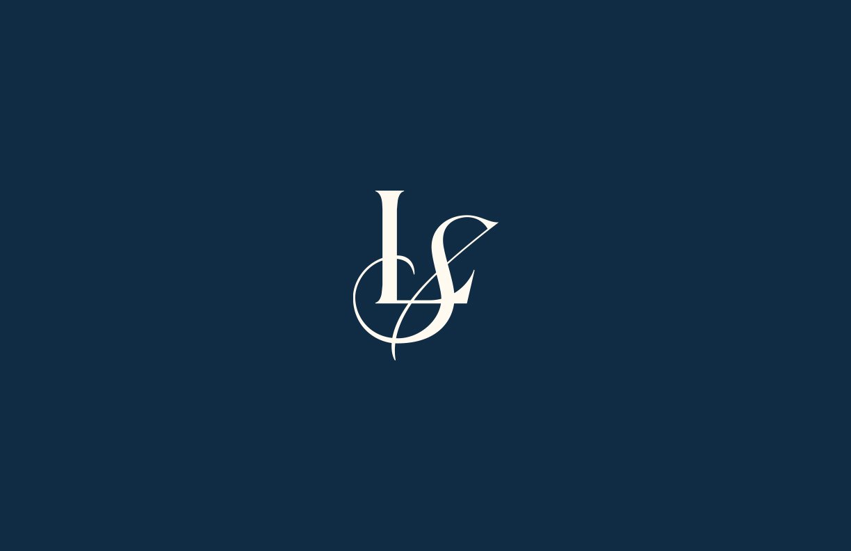
Just Finished: LaSource
LaSource is a bodywear brand on a mission to highlight the beauty and importance of women being the source of all life, thus shifting the stereotypical male tropes involved in the lingerie industry. The brand highlights feelings of comfort, confidence, and beauty through ornate and elevated design sensibilities, making it’s customers feel cherished. Motifs of flowers and the sun speak to the brands ethos that women are the source of all life. This is bodywear for women.

Just Launched: for fun
Having just shown you three openings, we thought we’d show you a fun sketch of a very peculiar wine bottle by our very talented designer and illustrator Zeb. We aren’t sure if there needs to be an extensive explanation or really none at all, but we’ll end with this. Enjoy!
Until next time.
As always, we’re so thankful for our amazing clients we get to make some insanely cool stuff with. We’ll be back to brag about more stuff this summer. See you then!
–Your friends at Box 8.